American Council on Renewable Energy 20th Anniversary Logo
special edition logo design
The year 2022 marks 20 years of the American Council on Renewable Energy, and with its anniversary came the desire to emphasize the occasion through the existing branding. The intention of this special edition logo was to build upon the classic logo (seen below), and create just enough of a flare to call out the celebration of 20 years, while simultaneously maintaining the integrity of the original design. The new logo keeps the existing design, however, successfully repurposes the existing elements to form the “20” seen below. The color gold is used to create additional emphasis on the “20,” and to tie it to the extra text, giving the context of the celebration of 20 years. Logo was created in Adobe Illustrator.
The Reform
LOGO DESIGN
This logo was created for personal training company, The Reform. The client’s request was for a logo that was simple, modern, and bold. The logo below delivers all three of those elements by using a classic black and white design, muscle outline to provide brand context, and a bright red to add accent and flare. Logo was created in Adobe Illustrator.
CLEANPOWER 2021 Conference & Exhibition
Updated Logo Design
As the American Wind Energy Association transitioned into the American Clean Power Association in January 2021, came the need to update and modernize preexisting event graphics, specifically for the CLEANPOWER Conference and Exhibition. The intention with this new logo was to use the concept of the existing event logo (see below) featuring the icons that represent wind and solar energy, and create more of a minimal, bold design that aligns with ACP’s new branding. This new logo incorporates the new ACP brand colors, as well as the iconic ACP circuit that serves in place of the ‘O’ in “POWER.” Additionally, this logo places equal emphasize on both wind and solar energy, another main goal of redesigning the logo to represent the brand’s evolution. Logo was created in Adobe Illustrator.
CLEANPOWER 2020 Conference & Exhibition
Background Story & Logo Design
Prior to the American Wind Energy Association merging into the American Clean Power Association came the vision of the CLEANPOWER Conference & Exhibition, previously known as the WINDPOWER Conference & Exhibition. The idea behind CLEANPOWER vs. WINDPOWER was to expand beyond wind energy to also incorporate solar and energy storage into the event as well. With the new concept of CLEANPOWER also came the need for new branding and graphics. The original WINDPOWER logo incorporated only a wind turbine, however the CLEANPOWER logo needed to express the new addition to the event. This ultimately led to the modernization of the look and feel of the logo, and the expression of the turbine blades and sun joining together, with the swoosh emerging from the sun. Logo was created using Adobe Illustrator.
Designing the Look & Feel
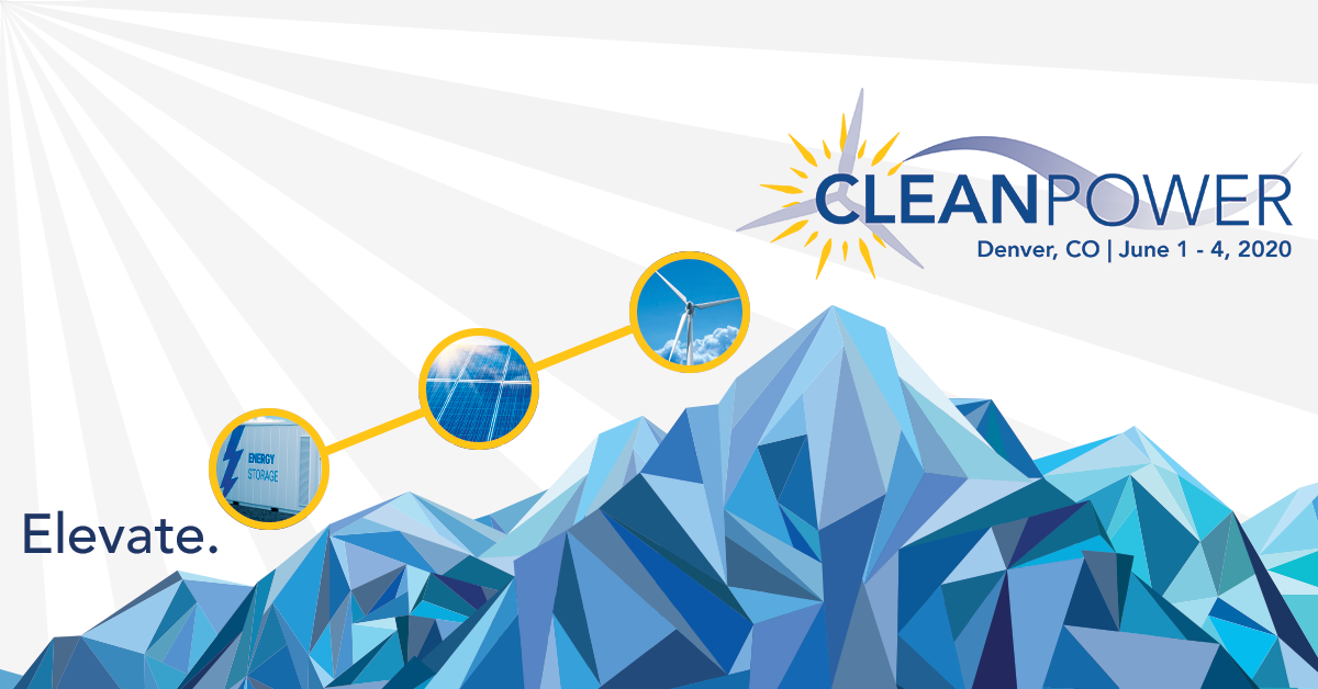
Following the creation of the logo came the need to develop an overall look and feel that expressed the shift in focus to include solar and energy storage into the event. As seen in the logo, the event was being held for the first time in Denver, Colorado, an area typically known for its scenic mountain views. This is how the concept of the geometric mountains and background emerged. The original theme of the conference was “Elevate Your Business,” eventually shortened to simply “Elevate,” which is also a concept I was able to use to our advantage visually. The mountains were designed with a natural peak, and since the branding of CLEANPOWER was being newly introduced, it felt natural to place the new logo at the top of the mountain, where eyes will naturally fall when looking at the image. To create a visual pathway for viewers, I then placed the circles with pan-renewable imagery leading up the mountains, quite literally reinforcing the idea that CLEANPOWER will “Elevate.”
Bringing Visuals to Life
Following the creation of the overall look and feel naturally came one of those, “Ok now, what?” moments. Being the introductory year of the new event layout, the goal was to create as much exposure for the new brand as possible, really emphasizing the shift from WINDPOWER to CLEANPOWER. Being a close-knit, collaborative team, I noticed that some of the team had put the static CLEANPOWER logo in their email signatures, which got my creative wheels turning. As someone with not only graphic design experience, but also animation experience (click here to learn more), I decided to bring my creation to life in Adobe After Effects, resulting in the logo GIF seen above. This GIF was then shared with the entire AWEA staff to include in email signatures. Once this was created and received positive feedback, we then decided to expand beyond just the logo to the larger branding, resulting in the GIF seen above. This GIF was shared on social media, as well as used for various advertisements with media partners. Animations were created using Adobe After Effects.
Application of Branding
Once the branding was set with the mountain theme and circle motif, these elements were able to be translated to other uses in addition to advertising purposes. These graphics were used to brand every element of the CLEANPOWER Conference & Exhibition, including but not limited to sponsorship and exhibitor prospectuses, informational documents, speaker highlights and slides, physical mailers, and finally, an exhibitor timeline guide, as seen above.
Industry Specific Event Graphics
In addition to the CLEANPOWER Conference & Exhibition, ACP (previously AWEA) hosts multiple industry-specific events across the country every year. Each event is specifically tailored for different segments of the industry and branded to reflect the subject matter of that particular event. Often times, the graphic will include the location, as well as a reference to the topic of the conference. Please note that graphics below were updated to reflect virtual event setting.


